The below shell script takes vcf file as an argument in the for loop and calculates the allele frequencies using VCFTools. These allele frequencies are used to calculate a folded SFS by taking only the major alleles in the calculation.
 for VCF in vcf_file_name.vcf
 do
 mkdir "$VCF".dir
 cd "$VCF".dir
 cp ../data/"$VCF" .
 for GQ in 20 40 60 80
 do
 #calculate allele frequencies with VCFtools
 vcftools --vcf "$VCF" --freq --out test.af --minGQ "$GQ"
 #Take vcf file and extract columns with allele frequency data, in this case the freq output we want columns five and six
 cut -f5 test.af.frq > test_col1
 cut -f6 test.af.frq > test_col2
 cat test_col1 test_col2 > test_append
 #removes blank line
 sed -e '/^ *$/d' test_append > test_append2
 #get rid of first line and first two characters (a/t/g/c:)
 sed 1d test_append2 > test_append3
 cat test_append3 | sed 's/^..//' > FILENAME_AFS
 #To keep only values below 0.50
 awk '$NF <0.50' FILENAME_AFS > FILENAME_AFS_50."$GQ"
 echo "0" >> FILENAME_AFS_50."$GQ"
 echo "0.1" >> FILENAME_AFS_50."$GQ"
 echo "0.2" >> FILENAME_AFS_50."$GQ"
 echo "0.3" >> FILENAME_AFS_50."$GQ"
 echo "0.4" >> FILENAME_AFS_50."$GQ"
 echo "0.5" >> FILENAME_AFS_50."$GQ"
 rm FILENAME_AFS test.af.frq test.af.log test_append test_append2 test_append3 test_col1 test_col2
 done
 cp ../makebars.r .
 Rscript makebars.r
 cd ..
 done
read.table(file="FILENAME_AFS_50.20",header=FALSE)->AF20
read.table(file="FILENAME_AFS_50.40",header=FALSE)->AF40
read.table(file="FILENAME_AFS_50.60",header=FALSE)->AF60
read.table(file="FILENAME_AFS_50.80",header=FALSE)->AF80
as.data.frame(table(round(AF20$V1,1)))->A20
as.data.frame(table(round(AF40$V1,1)))->A40
as.data.frame(table(round(AF60$V1,1)))->A60
as.data.frame(table(round(AF80$V1,1)))->A80
data.frame(Q20=A20$Freq,Q40=A40$Freq,Q60=A60$Freq,Q80=A80$Freq)->q
library(plyr)
library(ggplot2)
library(reshape)
Names=seq(0,0.5,0.1)
data=data.frame(cbind(q),Names)
data.m <- melt(data, id.vars='Names')
cbbPalette <- c("#000000", "#E69F00", "#56B4E9", "#009E73", "#F0E442", "#0072B2", "#D55E00", "#CC79A7")
jpeg("barplot.jpeg")
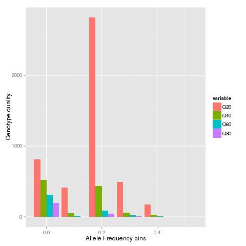
ggplot(data.m, aes(Names, value,fill = variable)) + geom_bar(stat="identity",position="dodge")+ xlab("Allele frequency bins") + ylab("Number of sites")
dev.off()
No comments:
Post a Comment